300.000 Km/s, Drawing with data
Francisco Martínez Mindeguía
 |
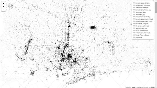
1. 300.000 Km/s, Dens and urban AMB Necessarily the project has clear contours, but the outline of the reality is vague. This is evident in the city, where construction does not immediately follow the project, is delayed and dilates over time and responds to interests that may differ from the initial ones. If the project delimits zones, it assigns uses and buildability of precise way, the constructed city, it fades and it is not possible to represent it with the same clarity. Understanding the city as this complex agglomeration of diffuse contours, the construction of a model that represents it requires operating with fragmentary information (diverse, of different origin and importance) that is necessary to order in order to visualize useful contours with which to work. Current experiences of data visualization applied to urbanism, with the use of new systems of search and verification of information, the introduction of GPS, Big Data, Open Data and the accessibility of social networks, appear as resources of which it is difficult to renounce and that inevitably condition the later phases of the project. What follows is the exhibition of three projects carried out by the 300.000 Km/s1group in the city of Barcelona, during the years 2012 to 2015. Some visualizations will be shown, ordered by the name of the project, in reverse order to the one of its execution, and by the title given to each one of them. The interest of these experiences lies in the way of shaping the information and in its ability to suggest ways of acting in the project.
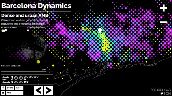
PROJECT 1. BARCELONA DYNAMICS (http://bcndynamics.300000kms.net/) Web version of the cartography constructed as an analysis tool of the Urbanistic Metropolitan Plan of the Barcelona metropolitan area (AMB), which was part of the exhibition Metropolis Barcelona2 and was published in Crosas (2015, vol.3). 1.1. Dense and urban AMB (fig. 1). The map shows the distribution of the resident population, superimposed with that of the population working in the same area. It tries to understand which is the fluctuation of the population as an effect of commercial, industrial and service activities. Divided the AMB with a mosaic of 400x400 meters, oriented with the cardinal axes, the process substitutes each cell for two concentric circles of different colour, yellow for the population that works in it and magenta for which it resides, whose diameter depends on the number of these populations located in it. If the one that works exceeds the resident, the larger circle is yellow and the smaller one is cyan (as a sum of yellow and magenta). If the ratio is the inverse, the larger circle is magenta and the smaller circle is cyan. The characteristic profile of the metropolitan area makes it easy to visually locate the different densities and, in the web version, a circle of 200 pixels, which can be moved with the cursor, shows the urban grid and the menu counter on the left of the screen registers the number of workers and residents at the indicated point. It is also possible to reduce the view frame to appreciate in detail the distribution. In order to construct this map, it was used information from the population base of the Statistical National Institute, the database of the Chamber of Commerce and the Cadastre Cartography. This information first had to be separated into plots and after joined in the cells of the grid. The result shows the effect of the commercial activity and the services in the centre of the city and the one of the industrial activity in the periphery. At the same time, it raises the need to expand the concept of population and how it should affect its distribution, for example, in the allocation of municipal services and facilities. The data of these populations is visualized also in another two different maps. The first of them, Metropolitan inhabitants (fig. 2), shows the distribution of the resident population, differentiating |
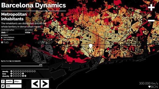 |
2. 300.000 Km/s, Metropolitan inhabitants the block unit with a same colour, on a gradual scale between white (for the highest density) and red (for the lowest). The second, The working city (fig. 3), shows the distribution of the working population in the same way. |
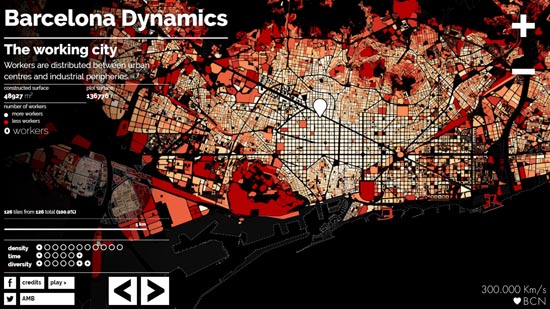 |
3. 300.000 Km/s, The working city. Comparing the two maps shows that the labour population is distributed more uniformly than the resident, which descends in the centre.. The three maps show two different modes of visualizing the results, which are also used in other maps of the series and that answer to criteria of clarity and operability. When there has wanted to represent the distribution of a single data is used the unit "block" or "plot, and a gradation of tones of the same colour. On the other hand, when they have wanted to value two or more, superimposed on the same area, one opts for the representation in grid of points and the use of only three colours. 1.2. Workers, companies and activities (fig. 4). The map shows the distribution of the economic activity of the city, relating the number of workers involved. |
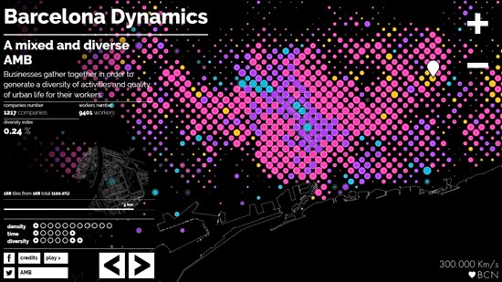 |
4. 300.000 Km/s, A mixed and diverse AMB. And it does so by means a grid similar to the previous one and the substitution of each cell by the superposition of a circle whose diameter derives from the number of companies located in the area And its colour of its smaller or greater diversity (yellow, magenta, lilac and cyan) and a circumference whose diameter derives from the number of workers. The result shows that the areas with the greatest diversity are also those that concentrate the greatest number of companies and workers, contradicting strategies that at other times sought to generate coherent aggregations. This reading is complemented by another map showing the intensity of the productive fabric (fig. 5). In it differentiates apples according to the number of companies they contain, in a 6-color gradation between cyan (minor number) and yellow (major number). The result shows a certain continuity of the activity, more intense in the central area of the urban nuclei. |
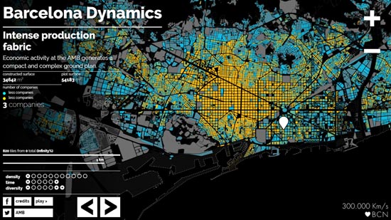 |
5. 300.000 Km/s, Intense production fabric. . PROJECT 2. BIG TIME BCN (http://bcndynamics.300000kms.net/)3. New historic plan of Barcelona, built in 2014 for his use from a mobile phone or from a computer, via Internet (fig. 6). |
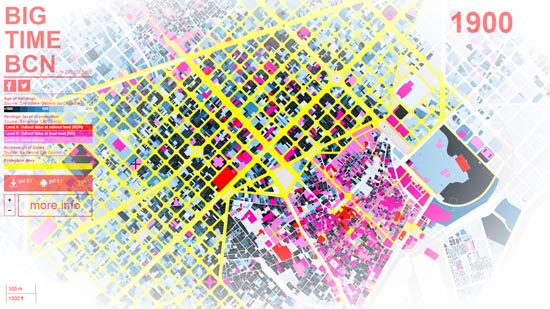 |
6. 300.000 Km/s, Big Time BCN (área central de la ciudad de Barcelona). It is an interactive map that gives information about the age of the buildings of the city, its patrimonial qualification and its history. Accessing from a mobile phone, and after locating the situation of the user in the city, it gives information of the buildings facing to which the user iso. At first glance the map offers three types of information. The first is the antiquity of the buildings, using 12 different shades of blue, darker for the older ones, which it affects the plot of the estate. The second is the cultural value of the building, by means of a striped superimposed on the previous colour, of red lines when it is of national level, magenta if it is of local scope and cyan if it is of urban interest. The third type is the Protection Area of the city, marked with a yellow shade that affects only the streets. In a second level of observation, the map shows the construction date of the building, placing the cursor on the plot, and, in the case of catalogued buildings, cycling on them displays a tab with the building data: name, level Protection, dates of construction and renovation, architect, use, description, subsequent interventions and, if necessary, a link to obtain more detailed information (fig. 7). |
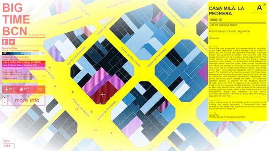 |
7. 300.000 Km/s, Big Time BCN (area next to Casa Milà) In addition, and with a more subtle lines, the map shows the ancient outline of some areas, currently transformed, which, as part of the urban memory, remember what once was there (fig. 8). |
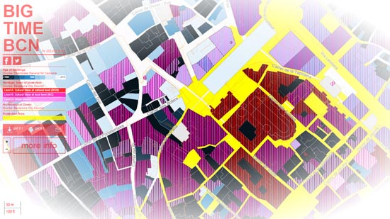 |
8. 300.000 Km/s, Big Time BCN (area near the Cathedral) At the same time, a graphical scale gives idea of the dimensions as a function of the size of the area that frames the screen. The map uses the bases of the General Directorate of Cadastre and of the Catalogue of the Patrimony of Barcelona, adapting the projection systems for a combined presentation of both sets of data. In total the map contains information of about 70.000 buildings and 3.000 protected monuments, of a period of more than 2.000 years. It is important to value the graphical treatment that has been given to the information of these bases in function of the scale (the zoom) to which the plant is shown. In a first state (fig. 6) the map is shown with the colours of the antiquity, with the colour of the striped occupying the whole plot and without contour lines. With the reduction of the framing and the reduction of the scale, the lines of the plot, the striped of the valuation, the old layout of the city, the name of the streets and the interior of the plots appear progressively (fig. 7 and 8). For the first time, the map shows in a single image the catalog of the city's heritage, understood as the result of a historical process. Making a resemblance not entirely irreverent, the map suggests a secular and plebeian version of the Nuova Pianta di Roma, by Gianbattista Nolli, in which the singularity of some buildings derives from a collective cataloging and in which all the buildings of the city appear differentiated, at least by their age. Mainly from photos and geolocated messages hosted on open social networks (Twitter, Flickr, Instagram or Panoramio), (OpenDataBcn) databases, or other online services such as taxi companies (Mytaxi), night buses (Nitbus), the bicycle network (Bicing) or the georeferenced sites in Google places.
PROJECT 3. ATNIGHT, (http://www.atnight.ws/index.php)4 Cartography of the activity not visible (at night) of the city of Barcelona that explores the possibility of knowing the city from the trace that this activity leaves in the social networks and in different urban data bases, carried out in 2012, with a catch period that has varied according to the provenance of the data. Mainly from photos and geolocated messages hosted on open social networks (Twitter, Flickr, Instagram or Panoramio), OpenDataBcn databases, or other online services such as taxi companies (Mytaxi), night buses (Nitbus) The bicycle network (Bicing) or the georeferenced sites in Google places. The atNight city is the city that one does not see, hidden behind the scenery of the advertisements, buildings and illuminated monuments: a discontinuous and intangible city, which the project aims to unveil with these resources, exploring its potential to make visible the connections between citizens. Currently the project is made up of 16 maps, of which two are shown here. 3.1. Barcelona is Barcelona (fig. 9). The map places the points from which messages and photographs were sent from Flickr (from the origin), Instagram or Twiter (in the last quarter of 2012), which contained the word "Barcelona" in the text. |
 |
9. 300.000 Km/s, Barcelona is Barcelona The result is a cloud of points that shows the places that the resident population or tourist identifies best with the city, and where it is possible to recognize the layout of some main streets and the location of some significant monuments. 3.2. Uniqueness vs. Identity (fig. 10). Map that detects the activity in the city from the data recorded in Instagram and Twitter. |
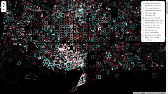 |
10. 300.000 Km/s, Uniqueness vs. Identity. The data are linked to the blocks and are visualized with the intensity and colour of their contour lines: red, if the activity is diurnal, blue, if it is nocturnal, and white when overlapping. With important irregularities and discontinuities, the map shows a city that maintains its activity throughout the day (white), while the rest is a set of zones (red and blue) with different rhythms that intersect without mixing.
CONCLUSION Visualization (to make visible) is the graphical matter of a knowledge process in which it is decided which operations will produce a clearer result and how the results will be shown in order that be understandable and indicate ways of response in the project. The selection of the data that is displayed is not an innocent operation, neither is its valuation nor the way in how they become visible. So important is the information in itself as the ability to "read it", to contextualize it, to value it and to draw useful conclusions from it. As Goethe put it, "we theorize in every attentive gaze directed at the world" (1810, p. 58), that look is active, it contains a question and of it depends what we finally see. All analysis is intentional because it seeks an answer. It is the intelligent use of visualization that is of interest in this process. Experiences such as these open up a wide range of possibilities to get to know the city better. The apparent simplicity of the results, the supposed immediacy of the result and the economy of the graphic resources involved, can confuse on the correct graphical evaluation of the result. But it is precisely in this apparent simplicity, that it hides a complex and subtle process of capture, filtering, storing, coding and visualizing, in the clarity with which complex themes are shown, and in the aesthetic seduction of the result where its interest lies. Maybe it is not possible to do a drawing of clear contours of a complex reality, but if it is possible to visualize the problem with clarityd. |
|
Notes:
References: Crosas, C., ed., 2015. Metròpolis Barcelona. Barcelona : AMB, (3 vols), vol. 3, 152 p, ISBN 978-84-87881-17-6. Goethe, J.W.V, 1810. La teoría de los colores. Traducido por J. Arnaldo, 1992. Valencia: COAT Murcia. Martínez, P. y Santamaría, M., 2012. Atnight: Visions Through Data. Mas Context, 15, pp. 172-183. Martínez-Díez, P. y Santamaría-Varas, M., 2014. Unveiling Intangible Barcelona. a+u: Architecture and Urbanism, 530, pp. 34-37. Santamaria-Varas, M., y Martínez-Díez, P., 2014. Cartografías de la ciudad nocturna a través del Big Data. Obra digital, 6, pp.34-50. Santamaria-Varas, M. y Martínez-Díez, P., 2015. atNight: nocturnal landscapes and invisible networks. En Bihanic, D. ed. 2015. New Challenges for Data Design, London: Springer London, pp. 119-137. (447 p., ISBN 978-1-4471-6595-8). Santamaría-Varas, M. y Martínez-Díez, P., 2016. La ideación del territorio de Barcelona a través de su representación. ACE: Architecture, City and Environment, 11 (32): pp.171-186.
© of the texts Francisco Martínez Mindeguía This article corresponds to the communication "Data visualization. The diffuse contours of the drawing" that the same author presented at the 39º Convegno Internazionale dei Docenti dell discipline della Rappresentazione e XIV Congresso UID, (Napoli 14, 15, 16 September) and that was published in AA.VV., 2017, Territori e frontiere della Rappresentazione / Territories and frontiers of Representation, Napoli, 2017, pp. 655-662, ISBN 978-88-492-8507-9. |
>> Back to the top of the page
>> Back to Dibujos Ejemplares de Arquitectura