MIES VAN DER ROHE's Office Building, 1922-1923
Juan Calduch Cervera, Universidad de Alicante
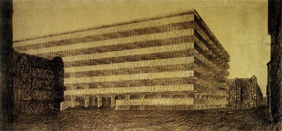 |
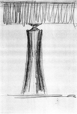
| Mies van der Rohe, Office building, 1923 (charcoal and pencil, 138x289 cm)
After World War I Mies went through a sort of professional split. On one hand, he carried out a series of projects which show the work of a good architect in his common practice, adapting his buildings to the tastes of the clients and developing his career along the same lines as in the pre-war period (Eichstädt house in Berlin-Zehledorf 1920-1921; Kempner house in Berlin-Charlottenburg 1921-1922; Feldman house in Berlin-Grunwald 1921-1922, Mosler house in Potsdam Neuebabelensberg, 1924-1926). |
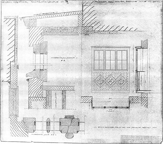 |
| Mies van der Rohe, Woodwork details in the Kempner house, Berlin-Charlottenburg, 1922 (pencil and colour pencil, 787x910 mm)
These projects are represented according to the graphic conventions of the time. But, in parallel, a new aspect of Mies appeared in a series of cutting edge proposals, not meant to be built in reality, which were presented in conferences or published next to some programmatic texts in magazines such as Früchlicht (1924) and G (1923). These drawings and the comments next to them show an aggressive, controversial, modern and provoking Mies. This phase ended in 1924 and, except for the courtyard-houses in the 1930's, possibly developed from the studies on plot-division in the Hubbe house, the architect would never again draw any pictures of architecture that didn't respond to specific assignments or conditions. Mies analysed and isolated, as in a laboratory test, various disciplinary issues that concerned him in these texts and drawings. It is as if the intended to clarify and classify his ideas through drawings and writings before implementing them. By 1925, his two career paths merge, opening the most fruitful stage of his European epoch, starting with works such as the monument to Rosa Luxemburg and Karl Liebknecht. |
 |
| Mies van der Rohe, Elevation study of the Monument to Rosa Luxemburg and Karl Liebknecht, Berlin-Friedrichsfelde cemetery, 1926 (pencil, 1020x557 mm)
The architect addressed five architectural experiments in those years. Three of them were urban: the two glass skyscraper projects (1919-1924) and the office building (1922-23), whilst the other two were located in a neutral ground outside the city: the reinforced concrete country house and the brick country house. None of these projects and drawings responds to a specific assignment, even though the first two were triggered by the contest for an office building in Berlin's Friedrichstrasse (1919). In fact, none of the other three have a specific site or plot. Texts and drawings complement each other, addressing parallel, and to some extent, autonomous issues. Therefore, the graphic documents should not be interpreted as an illustration or visual demonstration of the writings, so it is important to understand the polarity between them. Often, the texts do not mention issues which are key to the images or they express ideas which seem foreign and distant to the concerns set in the texts. Tracing the thoughts of Mies during those years must be done not only by studying what he built as an extension to previous stages in his career but also and above all by unravelling what the texts and drawings tell us, with their parallel statements, silences and discrepancies. After the various alternatives to glass skyscrapers that span the period from 1919 to 1924, the third essay which Mies addresses is that of an office building made of concrete, steel and glass, as described in an article published as “Bürohaus” in the first number of G magazine in July 1923 (page 3), mentioning modernity's most emblematic materials. Although the use of steel is not evident in the graphic documentation, it is possible that his statement alluded to the concrete's reinforcement or the windows' metal frames. The architect further commented on this building in an unpublished letter for the August 1923 issue of the newspaper Deutsche Allgemeine Zeitung. The only drawing that accompanies the text is a charcoal perspective of the building's exterior appearance. |
|
| Mies van der Rohe, Office building, 1923 (charcoal and pencil, 138x289 cm)
There are also two small ink sketches accompanying the notes. They are dated in 1922, proving that the architect had been meditating on this projects months before it was published. |
 |
| Mies van der Rohe, Letter with two sketches of the concrete office building, 1922 (ink, 141x225 mm)
The absence of floor plans is surprising, considering that the text engages in distributional explanations. The representation of architecture by means of plans, elevations and sections which provide all relevant details of the work, ignoring perspectives as they are thought to be characteristic of the drawings of painters, had already been postulated by Alberti in the 15th century. However, in the Memoria he addressed to Pope Leo X in 1519, and although he confirmed that the architect's drawings should be based on plan, elevation and section, Raphael added that the architect “should also know perspective, since it allows him to imagine the whole building wrapped in its ornaments”. Perspective, even though not valid for showing accurate measurements and proportions of the buildings because it deforms the angles, produces overlaps and distorts the sizes, gives a much closer image to human vision. Considering this recommendation, the fact that Mies used conical perspective in both the sketches and the published image is already showing us where his interests were in this case. In the sketches the building is represented as a partially-hidden background street closure, framed by other pictures in the foreground that are depicted as compact and dark shapes, only the profile of which can be discerned. The office building is shown in a foreshortened position, showing its side elevation and slightly more than half of its main façade. Both sketches are similar and in them the urban surroundings of the 19th century city have an important role by creating a theatrical frame for the building. All this is reminiscent of the scenographical drawings that had played and important role in classic treatises, from Serlio to the Bibiena, who brilliantly exploited the scenes with oblique or foreshortened architectural perspectives. It is therefore possible to detect a certain dependence resulting from tradition in these drawings. Undoubtedly the existing urban context which confronted modern architecture was a matter of interest to Mies, as these sketches bring out, and it is an error to publish them without these foreground buildings, as is sometimes the case. |
 |
 |
|
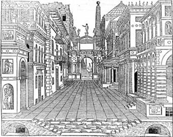
| Sebastiano Serlio, Tragic scene, in Second book of architecture: about perspective, Chapter III, plate 25, reverse (first edition: Paris, 1545) | Giusepe Galli Bibiena, Set, in Architetture e prospettive… (1740) |
The graphic design of both sketches is similar. The office building is represented by means of horizontal converging lines while the other buildings which frame it are drawn with thick vertical lines, creating a dark mass. The result is unequivocal: Mies's project appears in these sketches as clear and rational, as opposed to the confusing and dense vision (especially in the upper sketch) of the old city. The viewpoint is slightly different in each of them. In the upper sketch, it is approximately at the pedestrians' eye level, emphasizing the perspective effect and sharpening the angle formed by the two façades, reminding us of the low-angle drawings of the glass skyscrapers and of the influence of expressionism. In the lower sketch, the viewpoint is placed approximately at the height of the second slab, softening these effects and the contrast between the building and the surrounding city. Even though both sketches seem to have been done at the same time, the upper sketch refers more directly to some of the sculptural effects that the architect had used earlier in the glass skyscraper projects, such as the estrangement of the building in relation to its urban setting, the low-angle view and the greater contrast of light and shadow. In the lower sketch these resources are diluted, as if the architect was then interested in other aspects of the project, leading me to think that it was drawn some time after the first one, which still drew interest from the previous projects for skyscrapers. This second sketch is also framed by a line, as if it were a selected text to be developed. In fact, the large charcoal drawing is closer to this second sketch even though it doesn't really correspond to any of the sketches, as its viewpoint is placed slightly above a pedestrian's eye height and at a greater distance, thus making the horizontal lines predominant over the low-angle view of the corner angle. The visual contrast between the façade's horizontal stripes and the angle's vertical line is therefore resolved in a more balanced way in the final drawing. If we compare the contents of the article with the charcoal drawing and the sketches, we can find very striking disconnections and even contradictions between them. The graphic information and the descriptions seem to run in different directions, as if the interests of the person who is drawing weren't the same as those of whoever is writing. In the text, Mies focusses on: 1) addressing the problems of formalization of present-day architecture (the office building) through the use of the currently available materials and technology (reinforced concrete), 2) analysing the structural possibilities of concrete by optimizing its performance, 3) verifying the adequacy of the structural solution to the intended use for the building as offices, and 4) studying the relationship between structure (the skeleton) and façade (the skin), a central question in the architecture of Mies which he openly discusses here for the first time. However, the topics that appear in the drawings, especially in the charcoal illustration that accompanies the article, point to very different interests. In my opinion, there are basically two: 1) the possibility of applying classical formalization criteria to a functionally modern building (offices), using modern materials and techniques (reinforced concrete); 2) the visual control of the architectural image through graphical representation (hence the exclusive use of perspective); 3) the relationship and impact of a contemporary building in a 19th century urban context; and 4) the attempt to find a graphical code capable of displaying the textures of various modern materials: concrete and glass, that is, the conversion of these materials and techniques into and architectural language. I believe that, in this case, the pictures rather than the text is what gets us closer to the interests of Mies. The key is, precisely, in the heading he writes in the article for G magazine. The fact that, to prove what he says in it he uses an example of an office building is, in fact, secondary. That is why he silences and ignores some of the relevant aspects of such architecture which are not useful for his purposes. For example, the layout and location of the vertical communication stair wells and elevators, even though they are fundamental in the definition of the style, as had been established by the Chicago School. Or the right lighting of all the storey from the façades which had justified the use of glass in his skyscraper projects. By not drawing the floor plan, Mies is stating that the functional issues, which had been experimented on and treated in the two previous projects are not interesting to him any more. The article begins: "We reject Architecture is the will of time expressed spatially. Nor to the past, nor to the future, Creating the form with the means of out time, That is, our job is to create architectural form with the means that our time leaves at our disposal. A shape which responds to the laws which are the will of our epoch (the Kunstwollen), which reflects our time (Zeitgeist). These formal laws that reflect our time are, according to Mies, the contemporary interpretations of Schinkel's Classicism, as he had learned from his teacher Behrens, who in 1909 had built the small engine factory for AEG and 1911 had designed the German embassy in Saint Petersburg, the construction of which was supervised by Mies himself while working in Behren's study. With this experience, as he stated himself, he learnt to properly control the sense of scale and monumentality in architecture. It was therefore necessary to find an architectural language rooted in Classicism which was also capable of expressing the spirit of the time spatially using, precisely, the technical and material means of the time. It is anecdotal that the proposed example was an office building, as the same inquiry could have been done with any other modern building. The real goal is not to design an office building but to examine how to formalize the modern architecture of our time by means of a contemporary material such as reinforced concrete. Reinforced concrete structures On this point, the text reads: “The proper distribution of the workplaces determined the depth of the building, which is set at 16m. The most economic structure proved to be a frame supported by two pillars, with a span of 8m. and 4m overhangs on both sides. The separation between frames is 5m.” Apparently, a strict structural rationalism is the basis for the grid, which in turn is the basis of formalization. But looking at the picture we are assaulted by an important number of questions and doubts. The first one is that if the separation between frames is 5m it seems the depth of the building is more than 16m, given that the rear frame, from the cantilevered beams, suggests there are other intermediate pillars (eight can be counted according to the cantilevered beams in the side elevation) or the building turns like an L, thus giving rise to a whole series of structural and distributional issues in the meeting of the two arms, issues which are not mentioned at all in the text. The picture seems to suggest something more than a set of parallel frames, a bidirectional beam grid structure. Or are there maybe beams in one direction and bands in the other? But, in this case why do the beams and the bands seem to have the same section? And besides, how do the overhangs hold? Do the capitals of the pillars which can be seen through the windows respond only to structural reasons? It seems like the building has an L-shape because otherwise, how could the side elevation overhangs be explained from a strictly functional approach? What does the increased separation of the two first bays of the corner, precisely those that bear more weight, respond to? Mies also mentions and economic justification to this solution. But how should we interpret this criterion? He might be referring to structural and constructive economy in the Vitruvian sense of the word, that is, as the simplest and clearest solution, whether or not it is actually the least expensive in monetary terms. Functional suitability The functional justification for the solution provided by Mies also raises some other issues. Due to the lack of a plan, we know nothing about the distributional characteristics of the building. But in office buildings, the workplaces located more than 5 or 6 m. from the façade's openings are dark and need artificial lighting. Therefore, 16m. is not the most appropriate depth in terms of illumination, as it leaves a third of the surface without proper lighting, regardless of what Mies says in the text. In addition to distributional reasons, which we cannot verify due to the lack of a floor plan, the architect also justifies the façade solution with functional criteria. He writes: “The slab for each of the storeys rises at the end of the cantilevered parts, turning into outer skin, and serving as a background for the shelves, which have been moved to the exterior walls so as to make the interior space as airy as possible. A continuous band of windows reaching to the next slab was placed above the 2m shelves”. This solution is obviously anti-functional: inaccessible windows at a height of two meters in a time when all ventilation and air renewal was still done through the windows as there were no air conditioning systems, lack of any views to the outside creating a claustrophobic work environment and dark areas right next to shelves are only some of the issues. In summary, the functional justification to the solution that Mies gives in the text is, in any case, purely theoretical, and the drawings seem to contradict it. It really does not seem like the real goal of this project was to follow the functional suitability for the offices. The relationship between skeleton and skin In the architecture of Mies the relationship between the structural mesh and the building enclosure assumes a relevant role. In his European works, for example, the skin (whether glass or not) is clearly separated from the structural skeleton. Besides, there is no clearly defined physical limit between the architecture and its immediate surroundings, with the exception of his courtyard-house. Rather, the passage from architecture to surroundings is made through ambiguous spaces like covered outdoor areas, podiums which define the architectural territory even though they are placed outside the building, glass walls that visually extend the space toward the outside, etc. All these resources were clearly present in the German Pavilion in Barcelona in 1929. By contrast, in his American works skin and structural mesh tend to merge into one single plane while retaining their own autonomy and perception, which can be interpreted as a relic of neoplasticisim in Miesian poetics. This feature, so characteristic of his architecture was raised here explicitly for the first time. This is set out in a straightforward manner both in the texts and drawings. The text reads: “Reinforced concrete buildings are essentially skeleton constructions. No massing volumes or armoured towers. In frame structures the exterior walls are not load-bearing. Therefore, they are skeleton and skin buildings”. However, these sentences are rather ambiguous: why is this valid only for reinforced concrete buildings? Doesn't this skeleton and skin analogy fit better with steel-framed buildings, just like Mies himself would later prove? The possibility of treating the skin autonomously with respect to the supporting role (as Le Corbusier had proposed in his Domino structure) is an option which Mies wanted to try out there and then. The solution of a façade by alternating strips of full and void (like Le Corbusier's fenêtres en longueur), which Mendelsohn was already using in those years in his commercial and office buildings in Berlin, are a plastic subject that Mies was interested in. This is, precisely, the problem he wishes to control. A problem which is largely unaware of the material's structure and type and independent from any functional justifications such as the shelf to which the text refers. The issue of skeleton and skin was also implicit in the glass skyscraper projects. But in that case, Mies's main concern was the relationship between the typological definition (the skyscraper as it had materialized in American architecture) and the sculptural possibilities of a glass façade. That is why the structure of these skyscrapers is not shown in the drawings, and the attempt to define it remained frustrated in the corner of one of the unpublished drawings.
|
 |
| Mies van der Rohe, Study sketch for the plan of the structure of the curved-perimeter glass skyscraper, 1922 (pencil drawing, 774x956 mm)
Perhaps this failure is what led him to focus on the relationship between a frame bearing-grid (as the text says) or a reticular frame (as the drawing seems to suggest), whether made of concrete or steel, and the façade that has been released from its structural condition. The analysed problems are thus functionality and façade in the skyscrapers and structure and skin in the office building. Both relationships are understood as complementary in this period of Mies's architectural experimentation. Having analysed the problems and doubts related to this project raised by the text, we must refer to the pictures to try to unravel what really worried Mies but has been hidden in the descriptions. The urban environment: 20th century architecture in the 19th century city This is the most obvious aspect both in the sketches and in the charcoal drawing. The way in which they are represented in the sketches (horizontal lines for the project and thick vertical lines for the surrounding buildings) is eloquent in itself. So, in my opinion, the sketch was developed with a far away viewpoint so as to emphasize the expression of this relationship. The horizontal format of the drawing supports this reading. The building could have been shown isolated in the drawing, given that no information is given concerning its true location and that in fact, as we can deduce from the text, functional or distributional issues were the real reasons that interested Mies. However, the building appears between constructions which clearly refer to the eclectic character of the architecture found in European cities at the time. This character can easily be recognized in the charcoal drawing despite the high degree of abstraction in which the buildings have been represented, given their reduction to black shapes and silhouettes. The value of estrangement of modern architecture in this environment, a trait that reminds us of Dada provocations and that Mies had already worked on in his previous projects for the glass skyscrapers, is now faced in different terms. It is not so much the scale or the reflections and gleams as in the skyscrapers, but rather the treatment of their global shape and overall image, alluding to the search for classical qualities translated in terms of modern materials and forms. The image and the overall form of the building Unlike the broken or curved contour of the skyscrapers, in this case the building is a simple and expressive volume, with a prismatic form which shows a clear predominance of horizontal lines, reinforced by the alternating bands of windows and window-sills of a similar width, even though they are organized in a hierarchical distribution vertically, since not all storeys are the same, as in the previous projects for skyscrapers. There is a semibasement that serves as a base or foundation, a ground floor which is elevated over the terrain, five similar storeys and a penthouse over which a roof slab, different from the others, overhangs as a cornice. We can deduce from the main façade that the there are at least twelve parallel frames, even though there are some doubts. Apparently, there is an important access in the middle of the façade, comprising five bays and four pillars. The parapets frame the broad access stairway do not actually touch the supports of the frame and, therefore, the two side bays of this entrance are smaller than the three central ones, creating an A-B-B-B-A rhythm. Why are there not more or fewer storeys? The number of equal storeys varies in different drawings of the skyscrapers. What is the justification for this arrangement and for the rhythm of the openings, the solution to the frames, the base, the cornice? We find no references to these issues in the texts. And yet they are not marginal issues, as they are those which define the overall image of the building. Therefore, they cannot be impromptu decisions, and I believe they cannot be casual. All these aspects refer to a compositional code that refers to the values of Classicism. We could choose almost any of Schinkel's buildings and describe it in the same terms: base and plinth, horizontal prism, cornice, access porch, bay rhythm, topping cornice, etc. It is even possible that, should we stop to carefully measure the widths of the bays, the heights and the overall dimensions we would probably find harmonic or proportional relations between them that could easily be translated to classicist terminology. Mies often commented on his admiration for Schinkel and he was clearly interested in learning from the Prussian master. Even the National Gallery he built in Berlin in his last years can be interpreted as a challenge to the Altes Museum. In short, the overall picture of the building, its relations and rhythms, clearly refer to the values of the Prussian tradition of classical architecture, which Mies knew very well from his years of collaboration with Behrens. The subtlety of detail If we look more carefully at the charcoal drawing, we can confirm the hypothesis of Mies's will of defining a classical language translated to modern architectural terms. The capitals of the pillars (of which we are told nothing in the texts despite the emphasis on functional justification) evoke those of columns. They really do not have an obvious structural justification, as we can see the two end frames, which turn as if wanting to absorb the stresses from the lateral overhangs, something which does not happen in the other frames. But, don't the Ionic capitals on corner columns also turn? The first section is wider than the rest (which contradicts the stresses of the structural overhangs), and the concrete slabs stick out more the further up they are. These combined solutions intend to compensate, to some extent, the parallax view, and remind us of the corrections introduced by Greek architects to counter visual mismatches, like the entasis in the shafts or slight inclinations in the corner columns. This is clearly not an error but something intentional, because Mies takes it into account, increasing the size of the partitions between mullions in the corner windows as they are placed further up. In the façade, the overhanging ends of the beams act visually as the corbels or brackets do in the Classical orders. In short, all this points to matters that have been thoroughly discussed in the formalization of classical architecture form all eras. The drawing shows that what really worried Mies about this project, and what his experiments tried to determine, is how the use of a modern material (reinforced concrete) used to solve a modern architectural theme (an office building) can be addressed and resolved using classical formalization criteria. What at first sight appears to be a ground-breaking and pioneering project (and the content of the text supports this interpretation) is revealed, finally, as a test of the development of a language that follows classical tradition but is solved with modern materials. Text and image are, to some extent, autonomous and different and even contradictory in some cases. Graphic design I would still like to discuss some aspects of the graphic approach used in the charcoal drawing. In the previous representations of the glass skyscrapers Mies developed an effective graphic language in successive drawings, managing to properly represent the glass skin of the architecture, with its shades of reflections, veils, brightness and transparency, based on different experiences from the avant-garde arts (Expressionism, Abstraction, etc.). In this case he followed a similar process but with some differences, as if to deepen the search for a graphical code capable of expressing the texture of new materials using the formal resources of some avant-garde arts. Here, the representation of the rich values of the glass, which he achieved in the skyscraper projects, is lost. The glass looses all its mystery to become purely transparent. There is no trace left of glare, reflections, glazes or shadows. This picture was published in 1923, and he might have been working on it since 1922, coinciding with the latest drawings of skyscrapers related to the magazine G which appeared when this drawing was already published. In the last skyscraper drawings the plastic values of glass have been reduced to their purely abstract, even opaque, representation. |
 |
Mies van der Rohe, Study of the glass façade of a skyscraper with a curvilinear perimeter, 1922 (charcoal and pencil, 1385x832 mm) |
In contrast to the glass that disappears from the drawings, concrete emphasizes its presence by means of a rough texture, which is, to some extent and with a different texture, reminiscent of the way Le Corbusier represented walls made of this material. The tectonics of concrete takes on a greater presence in contrast to the visual absence of the glass. Surprisingly, Mies never actually used any concrete walls in his built projects, and it only appeared very rarely in visible structures as in the (unbuilt) projects for the Convention Hall in Chicago and the offices for Ron Bacardí in Santiago de Cuba. |
 |
Mies van der Rohe, Sketch of the pillars of the Ron Bacardí y Cía administration building, Santiago de Cuba, 1957 (pencil, 152x210 mm) |
The same year he also conducted a fourth experiment on the topic of a reinforced concrete country house where his interests seemed to lay in different directions. |
 |
| Mies van der Rohe, Perspective of a concrete country house, 1923 (pencil and pastel, 723x2193 mm) |
 |
| Mies van der Rohe, Perspective of a concrete country house, 1923 (pencil and pastel, 858x2285 mm)
But the graphic result of the reinforced concrete's texture (using colours) hardly differs from that proposed in the office building project, which could strengthen the hypothesis. That leaves open the question of how far graphic design and an effective control of the visual image of architecture, which might not have met the expectations set by Mies in regard to the use of reinforced concrete, could have influenced the subsequent evolution of his built architecture.
|
Recommended bibliography
- Fritz Neumeyer, Mies van der Rohe. La palabra sin artificio. Reflexiones sobre
arquitectura 1922-1968, El Croquis, Madrid, 1995
- Franz Schulze, The Mies van der Rohe archive, MoMA, New York, 1989.
© of the text Juan Calduch Cervera
Juan Calduch Cervera es Catedrático de Universidad,
at the Department of Expresión Gráfica, Composición y Proyectos of the University of Alicante.
This article has been adapted from that which the same author published under the title "L. Mies van der Rohe: experimentos arquitectónicos. Los proyectos de edificio de oficinas de hormigón, casa de campo de hormigón y casa de campo de ladrillo", in the magazine Asimetrías. Colección de textos de arquitectura, number 6, Valencia, 2002 pages. 51-75.
>> Back to the top of the page
>> Back to Dibujos Ejemplares de Arquitectura