MIES VAN DER ROHE, The Friedrichstrasse competition
Francisco Martínez Mindeguía
 |
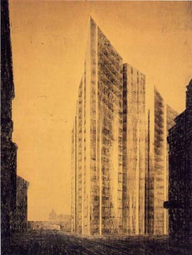
This drawing, done by Mies van der Rohe in 1921, for the Friedrichstrasse’s competition in Berlin. It is a charcoal drawing with an almost dramatic chiaroscuro that measures 173.5x122 cm. It is especially interesting for understanding the relevance of “how” the speech is constructed, beyond what objectively may be said about it. In 1921, the Skyscrapers Society (Turmhaus-Aktiengesellschaft) announced a contest in order to build a skyscraper next to the Friedrichstrasse train station in Berlin. Only architects belonging to the Association of German Architects BDA (Bund Deutscher Architekten) were invited to participate. They had six weeks to prepare their proposals, and around 140 projects were presented. Amongst them there were those designed by Hans Poelzig, Hans Scharoun, Hugo Häring, and Mies van der Rohe. Finally, the jury voted for the most conservative proposals. The contest ended up being a farce with publicity purposes since, in the spring of that same year, the company had already commissioned the project to the architects Möhring, Kohtz y Kraffert. However, it was never built due to the company’s financial problems. Mies’ project was presented under the code-name “Honeycomb” (Wabe). |
|
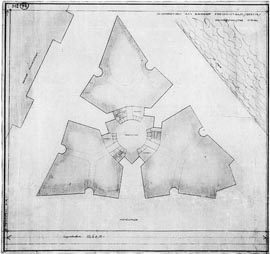 |
The building was a twenty-story tower with a triangular shape. All stories were alike, and they were divided in three parts. As Mies later said, the prismatic shape adapted to the triangular shape of the plant, and the sides were slightly angled in order to avoid the monotony usually produced when large surfaces are glazed. | |
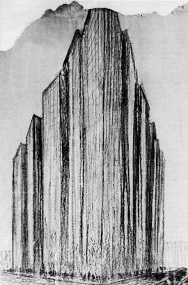 |
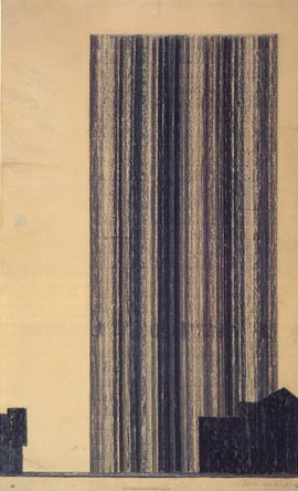
One of Mies’s first charcoal drawings represents the building in this manner. Only the upper contour gives information about the shape of the building. The inferior part of the building is a group of vertical, irregular, and inaccurate lines that seem to suggest the glaze reflections and the difficulty that they pose for perceiving the shape. This image that shows an unexpected variety will be repeated in later drawings, and it will become more polished (or modulated) gradually. In the lower edge he draws a pedestrian route as a scale reference to understand the building’s proportions. | |
 |
|
|
 |
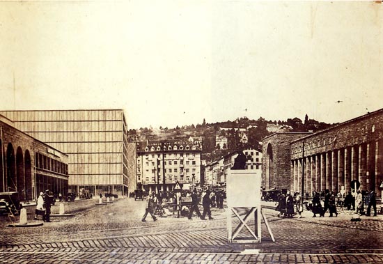
This is a photomontage that displays what the building would look like once built in its surroundings. It is not clear whether Mies presented it in the contest or not (Mies in Berlin, p. 325). Here, Mies uses the collage technique, an innovation from cubist artists. With it, those artists intended to put an end to the traditional idea of painting or drawing understood as a plane that shows the fiction of an event. Now they understood them as a construction, chromatic or not, on the surface of the support. With the collage technique, the accuracy, virtuosity, and artistic features were no longer appreciated in the reproduction of reality, and shape was the only aspect taken into consideration. The photomontage of Mies’ drawing seems to arise from a similar approach: why try to mimic reality if we can use photography? The approach is different, however. To cubists, collage was an ambiguous element introduced in the field of painting. It was a real fragment of a fictitious plane. Its worth depended upon the game of relationships that it introduced in this fiction. The architectonic collage, instead, adapts to the image of the photo and adjusts the framing and the vanishing points with the intention of blending with the photo and becoming part of it as a chameleon. Its ambiguity consists in the fact that collage has to avoid going unnoticed since the drawing must be recognized as such, as a proposal in its surroundings. This way, the drawing takes advantage of the realism of photographs in order to reach the verisimilitude that it lacks and that would make it more believable. |
|
Since the final years of the 20th century, skyscrapers became the symbol of progress, the representative monument of modern society. It was an invention of the American culture which was copied in Europe as a proof of economic development. Their symbolic value substituted the relevance that cathedrals had centuries before. Mies’ collage shows the building as a gothic cathedral, rising over the city. This is the skyline which was proposed for the new city, in order to replace the traditional one. Berlin, as other relevant cities in Europe, saw in skyscrapers the symbol of progress. |
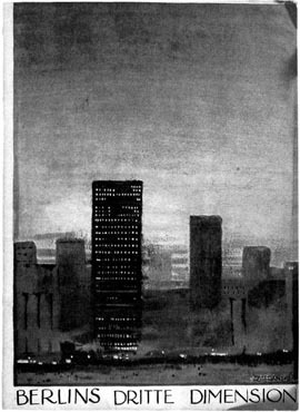 |
This is cover of Berlins dritte Dimension (Berlin’s Vertical Dimension) published by the Berliner Morgenpost (Berlin Morning Post) in 1912. It is a supplement that gathered the opinions of important people in the city. In it, Walter Rathenau, AEG Manager, stated: “nothing as impressive as the city of New York has been created since the Middle Age…For the first time, the creation of these façades that rise to harm the sky manifest the birth of a new constructive idea in architecture.” Architect Bruno Möhring, editor of the Berliner Architekturwelt and organizer of the German Pavillion in the Louisiana Purchase Exposition, informally known as St. Louis World’s Fair, held in the U.S. in 1904, could not see a reason why buildings that high could not be constructed in Berlin. It also contained Peter Behrens’ opinions, who could not forget the strong impression when he entered New York’s Port, when he saw the city appear as a light in the mist, creating a sort of surrounding mirage. Behrens saw in skyscrapers the advertisement of a new kind of architecture. |
|
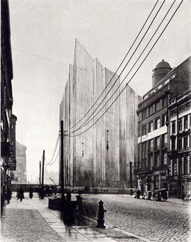 |
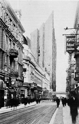
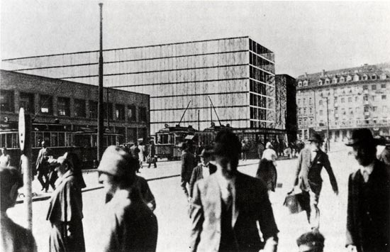
The drawing that we are talking about starts here (it is a photo of the original one, which got lost). It is still a photomontage, but for some reasons still to be deduced, Mies gives up the previous image and starts working on this one. This way, he also changes the contents of the previous speech. The urban environment is radically different. The former one was a centric commercial street full of life; it is the image of a “prosperous” city. This one is the image of a suburb, prematurely degraded and aged, in which people sleeps at night again, and activity is scarce during the day. The building still appears as a giant, exhibiting modernity in contrast to the degraded appearance of the urban surroundings. The building’s glazed image is in contrast with that of the sad, old, and uninteresting surroundings, aged despite being from the late 19th century. |
|
The building is seen overcoming its surroundings’ height, with its surface modulated by the glaze reflections. The upper part is still showing the plant’s shape and the geometric partition of its surface. The lower part loses accuracy and seems to become the opposite of its surroundings. The idealism of the skyscraper’s image becomes stronger in the darkness and the lack of interest in the surroundings: it is the future appearing as an objective beyond the present reality. The new framing allows to see the building alone, arising from the darkness of the ground (as seen in the elevation plan), and enlightened as it arises. Mies realizes that this psychological value is interesting, and he improves it in the following image. |
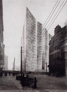 |
In this third perspective projection, Mies draws a transparent building. Its glazed surface keeps its reflections, but it allows seeing through the different interior plants. The building is clean, crystalline,…it is not just reflections anymore. The picture of the surroundings is the same one, but Mies darkens it and at the same time, lightens the building. Observing the edges of the drawing, it is noticeable that the photo is not totally darkened, possibly because he has decided to cut it. When he published this work in Bruno Taut’s magazine Frühlicht, in 1922, he explained that only skyscrapers under construction exhibited his constructive idea clearly: it is then when the impression of the skeleton’s height is overwhelming. When walls are built this impression is completely gone, the constructive thought is destroyed and often times it is suffocated by a confusion of trivial and pointless shapes. Mies saw that the glazed façade could still show the skeleton structure of contemporary skyscrapers thanks to its transparency. He shows this idea in this drawing: the glazed surface, with its reflections and transparency, exhibiting the interior structure. |
| The drawing is now a poetic image. The building is weakened, with its apparent nudity, in front of dark and somewhat oppressive surrounding. But it is also idealized in front of the dark reality of the surrounding environment. The building is the symbol of a pure conscience, which does not hide. |
 |
In the next version of the drawing Mies cuts the image the following way. The building is not modified, but its surroundings are. With this framing reduction, Mies will prove that his interest is no longer explaining how the building relates to its surroundings, which were only the frame that gives value to the building. |
|
|
Mies does the drawing again, discarding the photo. He is no longer trying to show what the building will look like when it is built. Now, the surroundings are only a shadow, reduced as much as possible to display the dark framing that allows the building to exhibit its features. The drawing transcends this way the purposes of the contest, and becomes the manifest of a new architecture, the expression of an idea. As Giulio Carlo Argan (El Arte Moderno, p. 360), to Mies, at this point, it makes no difference to show the relationship between the city and the building: his interest is shape as an absolute value, and whether or not the artistic shape is absolute is not related to anything; light is the only construction material through which the architect expresses himself. There is another relevant aspect in this drawing. Mies draws on top of the photographic reference, but he modifies it. He keeps the contours of the building next to it, eliminates the bridge and the protections over the river, and alters the background of the street, placing the railway bridge in there, which did not appear before, and also adds a vanishing profile which did not exist in the photo. |
|
 |
Inevitably, the following question arises: what did Mies intend by altering this profile? This would have been the image by simply changing the bridge’s position. Why did he not leave it the way it was? |
|
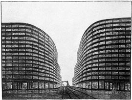 |
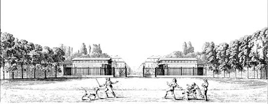
Poelzig had already experimented with a vanished perspective projection of this kind. It is two buildings framing the access to the bridge over the Ring river in Cologne, a project from 1925. Here, the bridge’s alignment becomes a curve and the vanishing point “seems to leave” and disappear. One example more interesting is the following drawing by Karl Friedrich Schinkel. |
|
 |
|
|
 |
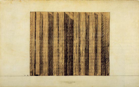
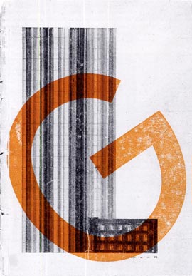
Mies’final drawing, with no photomontage was published in Bruno Taut’s magazine, Frühlicht, in 1922. At this time, Mies was the director of the architecture group known as the Novembergruppe (1921-25). In the following version of this project, Mies discarded the projection perspectives and worked directly on a model. He photographed it and did a photomontage with some trees in the background. In this case, he only did the elevation drawing, similar to that of the first project, and he published it in the cover of the G magazine (Gestaltung), in 1924. He collaborated in this magazine, and he also helped financing it. |
 |
 |
|
| Alzado del segundo proyecto |
El alzado
en la portada de la revista G |
| Another drawing where Mies introduces the vanishing point theme is the project of the concrete office building, in 1923, for the Grosse Berliner Kunstausstellung (Great Berlin’s Art Exhibition). It is drawn with charcoal and graphite, and its dimensions are 139x289 cm. |
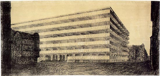 |
Mies did a model and this perspective. It is not a project to be built, but rather a sort of manifest about what reinforced concrete allows doing and how a concrete office building can be designed. It does follow some of the features of the previous drawings, such as the dark background, possibly obtained from a photograph, too. The building is shown with an interior light in contrast to the surrounding darkness, implying the advance of the new world vs. the old one, modernity vs. classicism. A feature which could be irrelevant but is repeated in many of his perspective projections is the fact that the corner does not appear in a symmetric position. One side tends to be frontal, while the other is foreshortened, being the vanishing point at the end of the street. In an apparently unjustified way, the perspective projection shows both sides of the lateral street as well as the vanishing point where they converge. A similar case is the S. Adam Store project, in Berlin- Mitte, in 1928. The drawing is smaller, 20.3x15.2 cm, and is done with a different technique, gouache and airbrush, which allows increasing the geometric accuracy. He uses photomontage once again, and the framing is like the one used before. |
 |
There is something “arguable” in this perspective projection regarding what it apparently intends and what it actually achieves, since the front side is barely seen and the one that can be seen completely is foreshortened. Why did he not change the direction of the projection? Or rather, what interest did he have in showing the vanishing point? Since this is the reason for both inconveniences. The vanishing point is possibly the testimony of an abstraction. What Mies is seeking in these drawings is not just representing a kind of building, but rather doing a “manifest” about what the new glazed architecture or either the new reinforced concrete architecture or masonry architecture must be like. In these representations, the vanishing point is a symbol of the absolute, the absolute value of the exposed, as it was in either Toni Garnier o Ledoux’s great perspectives. If he was intending to portray the building in a more “orthodox” manner, it would then be the following: |
|
 |
But this is a “normal” image, and it does not have the transcendent connotation of the previous one |
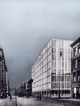
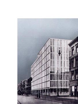
The following drawing was done in 1928 and belongs to the contest for a bank building and big store in Stuttgart. Again, it is a drawing of important dimensions, 150x96 cm. Compared to all the previous ones it is possible to confirm the importance that the presence of the vanishing point had in all of them. In this case, the perspective projection is completely frontal, with an almost hidden lateral side and the vanishing point in the centre, over the buildings which complete the scene in the background. It is a contest and all participants were allowed to use the same photographs. |
 |
 |
In the two previous images, what was “overwhelming” before is now normal.
|
Recommended bibliography:
- Phyllis Lambert, Mies in America,
Montreal and Nueva York, Canadian Centre for Architecture y Whitney Museum
of American Art, 1965.
- Philip C. Johnson, Mies van der Rohe, Nueva
York, The Museum of Modern Art, 1978.
- Fritz Neumeyer, Mies van der Roh. Le architetture,
gli scritti, Milán, Skira, 1996 (original ed. in German,
Berlin, 1986).
- Franz Schulze, The Mies van der Rohe Archive,
Nueva York, Garland Publishing, Inc, 1992.
- Dietrich Neumann, "Three Early Designs by Mies van der Rohe",
Perpecta, n. 27, 1993.
- Terence Riley and Barry Bergdoll, Mies in
Berlin, New York, The Museum of Modern Art, 2001.
© of the text Francisco Martínez Mindeguía
© of the English translation Ruth Costa Alonso
>> Back to the top of the page
>> Back to Dibujos Ejemplares de Arquitectura