VIOLLET-LE-DUC, Entretiens sur l'Architecture, 1863
Francisco Martínez Mindeguía
|
|
This image corresponds to an engraving from Entretiens sur l'Architecture, that Viollet-le-Duc Publisher in 1863 and 1872 (this is the 22nd plate). There is no doubt that the aim of this drawing is to show the metal structure that supports the stone cupolas. Viollet-le-Duc has proportioned the line values according to the importance that each part plays for such explanation. Metal pieces are those which can be seen best. He draws two of them and decomposes one to understand its functioning better. This structure supports a combination of pendentivedomes, of square base, and octagonal based recessed domes, with two sides coincident with the nave walls. This part is at the top of the plate. In the lower part the pavement is shown and the image of some people that enable an understanding of the nave dimensions. The walls of this nave are "diluted" at this bottom part and even disappear into the background. |
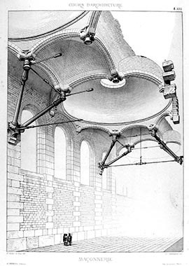
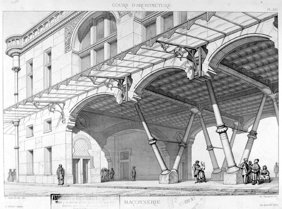
| By the framing and the modulation of line strengths, Viollet-le-Duc focuses the drawing subject, so that the observer understands clearly what he intends to communicate. This is an example of the importance that selection has in a drawing. If the purpose of the drawing is an explanation, it is important to differentiate what is important from what is secondary, or even eliminate what may distract without adding anything to the subject understanding . Although the drawing is not a text, with a fixed reading order that must be followed, the draftsman may condition the beginning of the drawing reading, attaching more value to such parts. In other drawings, Viollet-le-Duc also achieves a concentration on what seems to be most important. One of them is the 21st plate of this same book . |
 |
|
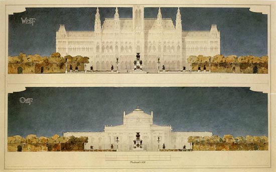
Another similar exemplary drawing is that by Otto Wagner, published in Einige Skizze · Projecte und Ausgeführte Bauwerk (sketches, projects and unbuiltbuildings), in the 1896 volume (plate 4) . |
 |
|
The next drawing, of the same book, Volume IV, 1906, 14th plate, achieves the same result with similar resources
. |
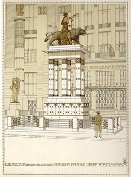 |
An image of the Vienna museum: the elements of the foreground, drawn with strong shadows and contrasts, and the background in a uniform tone . | |
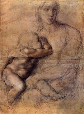 |
The result is similar to a drawing by Michelangelo, the Virgin and Child, on which the shadows of the child’s body, in contrast with the drawing of the Virgin’s body without relief, brings focus on the former .
Something similar to the previous drawing happens in the following one, by Joseph Kleihues.
|
|
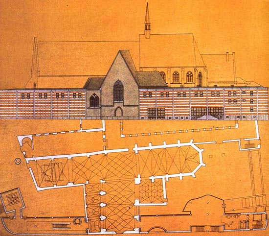 |
| In this drawing, the foreground is clearly differentiated from the background, by the contrast between the white and the uniform background tone. Moreover, in this drawing there is an interesting composition. As noted in the plan, Kleihues’ project is at the front following the road alignment, and continuing one of the church façades. This justifies the colour treatment and why the original building appears in the background, without contrast. Kleihues uses the plate to compose elevation and plan. This is why the façade fills the whole width of the plate and splits it in two parts. The colour of the façade ground is the same as that of the plan, where sectioned parts are drawn white. Thus, Kleihues manages to gather both projections, without causing any confusion owing to it. |
Recommended bibliography :
- Viollet-le-Duc, Entretiens sur l'architecture,
2 volumes, 1863 y 1872.
- Otto Wagner, Einige Skizze · Projecte
und Ausgeführte Bauwerke, 3 volumes, 1890, 1896
and 1906.
© of the text Francisco Martínez Mindeguía
© of the English translation Monica Stoinea and Antonio Millán-Gómez
>> Back to the top of the page
>> Back to Dibujos Ejemplares de Arquitectura