FRANK LLOYD WRIGHT, some drawings
Francisco Martínez Mindeguía
|
|
|
|
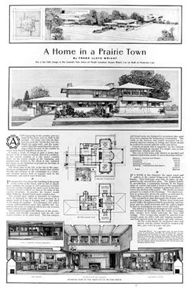 |
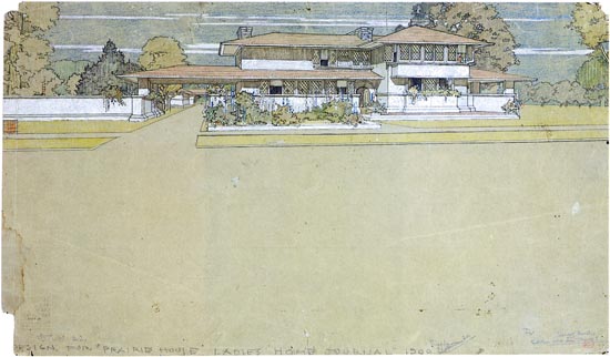
( In fact, this is the page of the magazine in which the drawing was published ). Wright was conscious of the importance these magazines had in order to reach a great group of possible clients. As he was conscious of the appeal these drawings should have. He published four projects in the magazine and readers could buy copies of the drawings for 5 dollars. |
|
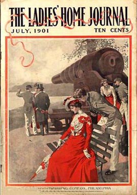 |
This was one of the magazine covers, in the issue of July that year. | |
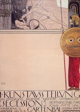 |
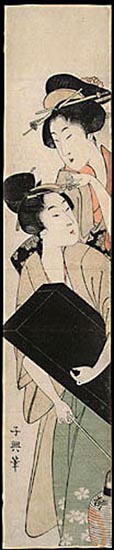
The composition of Wright’s drawing reminds us of some works of the Viennese Secession, such as a poster of Gustav Klimt, dated 1898. |
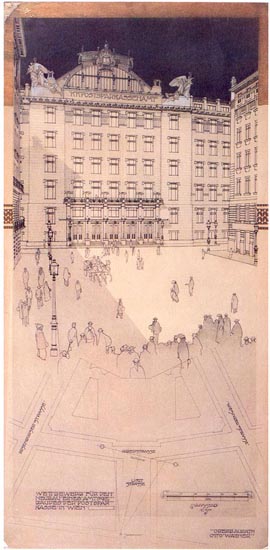
Or other drawings by Otto Wagner, for the Savings Postal Box building, in Vienna, dated 1903. |
|
|
|
|
 |
Or even a church, also by Otto Wagner, made in 1918, published in Einige Skizzen Projecte und Ausgefürte Bauwerkw (Sketches, projects and unconstructed buildings), Band IV, 1890, 1896 and 1906 (reedited in 1987 by The Architectural Press, London). |
|
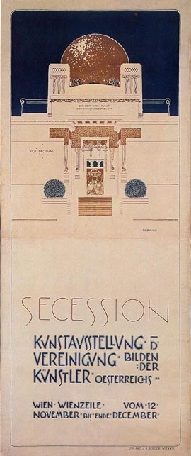 |
Even another Secession poster by Joseph Maria Olbrich, 1898. The image displacement to the upper part induces an indirect interest in the lower part, which remains oddly empty. This raises a question that the observer must inevitably solve, in order to give a logical sense to the composition, in the conviction that drawing is a sort of language that the architect/ artist uses to explain something. The coincidences between Wright´s drawings and those of the Secession artists are varied. One of these characteristics is the inclusion of text as part of the drawing. In both cases, the text adopts formal values, grouped and fitted or reinforcing the contour line and included as part of the very drawing. In both cases, it is customary to draw the drawing edge and indulge into taking the drawing up to such limit. They are usually clear and precise line drawings. Another common feature is the use of logotypes to sign the works, possibly an influence of the common interest for Japanese engravings, which spread around Europe and United States in that time. They were compositions of the full name initials, limited by a square. That of Frank Lloyd Wright was his well-known red square. |
|
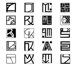 |
Several logotype compositions by Secession artists can be found. Some included here orderly: in the upper line those by Ferdinand Andri, Joseph Hoffmann, Maximilian Lenz and Emil Orlik; in the second line, those by Joseph Maria Auchentaller, Rudolf Jettmar, Wilhelm List and Alfred Roller; and in the third line, those by Rudolf Bacher, Gustav Klimt, Elena Luksch-Makowsky and Othmar Schimkowitz. In the fourth, those by Leopold Bauer, Friedrich König, Koloman Moser and Ernst Stöhr, and in the last line those by Adolf Böhm, Maximilian Kurzweil, Felician von Myrbach and Leopold Stolba. They probably derive from the influence of red seals used in Japanese engravings, which also contain the artist name. |
Wright is a particular figure concerning his drawing production. He said he drew little, but many of his drawings are preserved, most of them perspectives, although it seems that he did not draw them; rather, he was helped by assistants. Wright used perspective as a working tool, in order to elaborate and show the projects. He rarely made scale models; instead, he managed to control the form of his projects solely by using drawings: plans, sections, façades and perspectives. Wright drew many perspectives, although - according to one of his collaborators- the project was solved in plan, façade and section, perspectives being only a verification system. Besides, Wright once said that he did not begin to draw before the idea had been formed in his imagination, in such a way that he could already distribute the furniture and even place vases with flowers inside. According to Wright, he would visualize the building inwards before drawing it. Perhaps for that reason few first hand drawings are preserved since, generally, their first drawings were already made with rule and compass. In the same way, few intuitive perspectives have been preserved. When a perspective was in the process of production, everything else was defined already. Doing it with metric control had the objective of avoiding involuntary errors. |
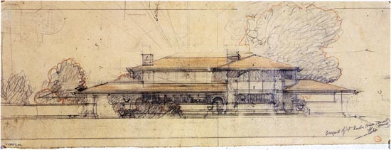 |
Here you can see another perspective of the previous project, dated1900. Although it seems a frontal perspective in some parts, it is in fact a front view. During the first years Wright only built field houses during the first 1900s. The first nonresidential commissions of some relevance were the Larking building, of Buffalo (NY) and the UnityTemple, in Oak Park, both dated 1904-5. And he practiced new graphics with these projects. |
 |
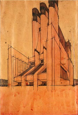
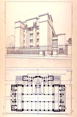
This one is a 1904 drawing, depicting the Larkin Company, Buffalo, New York. Drawn with black ink and relatively small, it only measures 152x279 mm. The drawing is quite different from previous ones, with a forced foreshortening, in which the image is hardly comprehensible, because almost everything is in shade. The point of view is low and the aperture angle is very big as you can appreciate by the deformed superior, with an angle smaller than 90º. We could recall some of the perspectives that Antonio Sant' Elia would make ten years later, with a similar aspect. |
|
 |
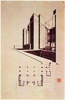
This drawing by Antonio Sant' Elia, dated 1913-14 was prepared for the exhibition of the Città Nuova exhibition, in Milan, 1914. In his first drawings, Sant'Elia was influenced by the Venetian Secession. And in the Città Nuova he showed a series of perspectives of an utopian city, built on streets at different levels, with power stations, airports, train stations and skyscrapers. Sant'Elia thus reinforced the sensation of height of these buildings lowering the point of view until ground level and opening the field of vision until the buildings sides were deformed. The distortion produced by this opening and the uncommon location of the viewpoint suggest that the object represented is also something “new”. In this way, the increase of the field of vision allows the inclusion of future limits he proposes. The very reasoning seems to justify Wright‘s drawing. Curiously enough, he is using black ink. |
|
 |
The extended composition is another characteristic that again suggests a connection between some formats of Japanese engravings, of which Wright was a collector. |
|
 |
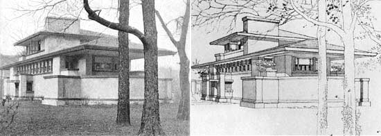
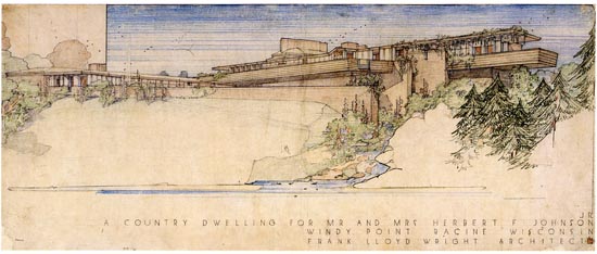
Wright will use this format in other drawings as well, like this one of the Thomas P. Hardy House, in Racine, Wisconsin, 1905. In fact, it is produced in another reduced size -152x483 mm.- finished with watercolour and gouache. | |
 |
Another one is the Larkin Company perspective, also dated 1904. Its larger size - 533x914 mm.-enables a better understanding of the building form. Wright’s classic red logotype can be seen under the perspective right corner. |
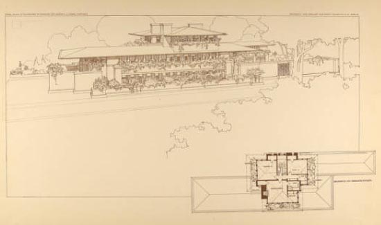
Wright repeats this type of drawing in other cases, with a single monochromatic opaque shade, such as the perspective of the Robbie House, of Chicago, Illinois (the drawing is of 1906). It measures 939x559 mm and, although the image does not show it, it is made in brown and blue ink, on a cream coloured paper. |
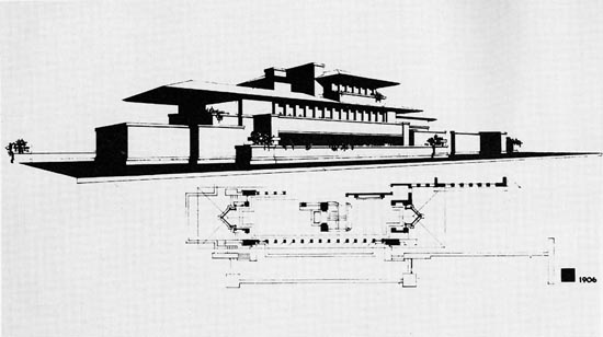 |
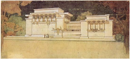
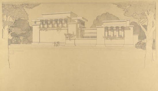
Another perspective of the Unity Temple, in Oak Park, Illinois (dated 1906) measures 914x584 mm and, like the previous one, it is also drawn in brown and blue ink. |
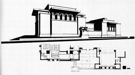 |
Anyway, this is not one of Wright’s classic drawings. The next one, however, representing the UnityTemple, dated 1906 is one of the classic ones. The drawing measures 635x305 mm and is finished with brown ink and watercolour. |
 |
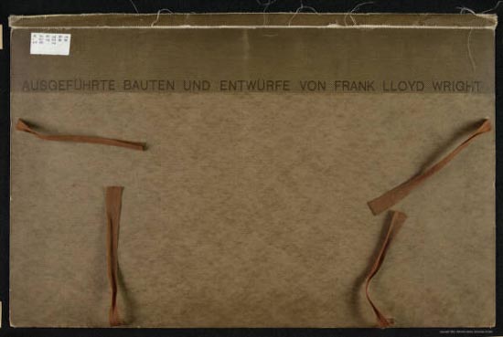
Shortly afterwards, in 1910, the Berlin publisher Ernst Wasmuth published his drawings and Wright made a promotional trip around Europe. The publication consisted of two folders of drawings and texts of his projects. Entitled Ausgef�hrte Bauten und Entw�rfe (Made constructions and sketches), Berlin, 1910, it contained 40 plates. |
 |
|
Here you can see the folder. The drawings collection was reedited in the United States by Horizon Press in 1963, although already by 1959 some coloured watercolours by Wright had been published (Frank Lloyd Wright Drawings for a Living Architecture). The MOMA made an exhibition containing exclusively drawings by Wright the previous year, in 1962. The success achieved by Wright’s drawings always achieved phenomenal success. Next, some drawings from the folder. |
 |
 |
|
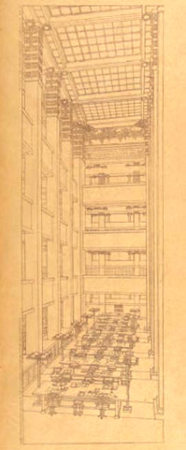 |
These three images represent the Larkin Company building, once again. They are drawings made specifically for publication and, according to a verified source (H. Allen Brooks, in The Art Bulletin, vol. 48, nº 2), many of them were based on photos of the constructed building. |
In this image from the above mentioned article, Brooks headlights coincidences, that even affect vegetation and the (opened) position of a window. Regarding the photo, the sketcher changed the position of the shades, possibly with the aim to improve the reading of form. |
 |
Here is another drawing from the folder, the Robbie House, in this case. |
 |
And here the Unity Temple again. |
 |
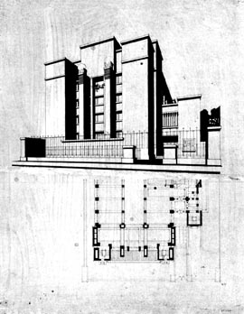
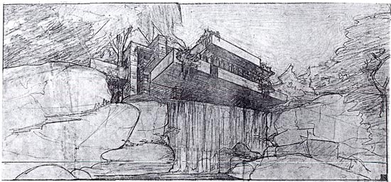
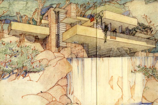
In his article, Brooks attempted to differentiate drawings from each assistant who seem to have participated in the works (a total of 5, including Wright). Nevertheless, it is obvious that despite the intervention of different draftsmen, the character of all the plates is similar, and that they operate under the influence of Wright. It is also known, by testimonies of his collaborators, that they did not stop until he considered the drawing was well finished, working side by side with each of his assistants. Wright used to make more than one perspective of the same building, in order to test different aspects of the proposal. He used to choose different points of view to study the volume, the interior spaces, the relation between elements or the placing in the surroundings. These drawings served to polish, develop or confirm an idea. The following one is a drawing of the Kaufmann House, better known as the Waterfall House, in Mill Run, Pennsylvania, dated 1935. |
 |
|
|
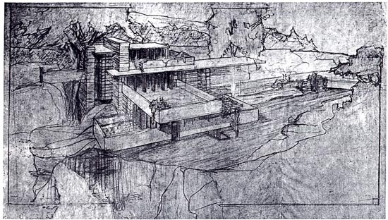 |
| (Another working drawing.) |
 |
|
This one is already a presentation drawing of the Kaufmann House, made in pencil and coloured pencil; it measures 838x432 mm. Generally, perspectives were fitted by some of his assistants (the mechanical part) and then Wright finished them, adding colour, vegetation and details. |
 |
|
|
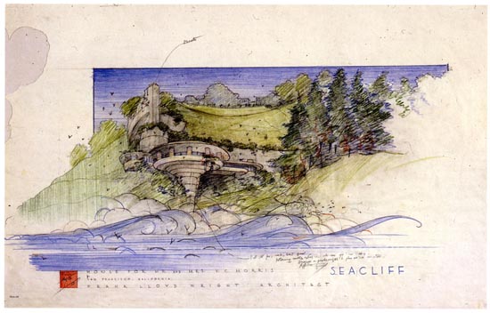 |
| (A drawing of the Morris House ( in Seacliff, San Francisco, 1955) made in pencil and coloured pencil, 889x559 mm.) |
 |
The habit of darkening the upper part of the drawing is related to the practice of some Japanese engravings |
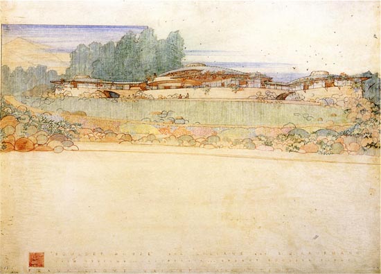 |
| (A drawing of the Boulder House, in Palm Springs, California, 1951; pencil and coloured pencil, 889x660 mm) |
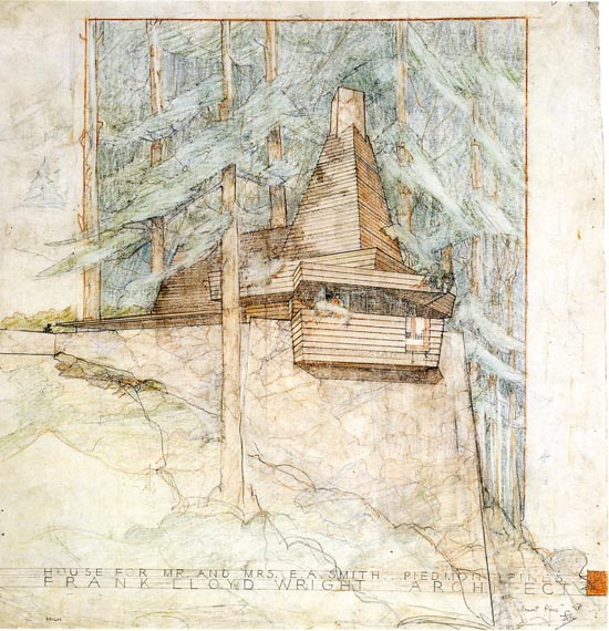 |
| (A drawing of the Smith House, in Piedmont Pins, California, 1939; pencil and coloured pencil, 559x584 mm). |
Recommended bibliography:
- Arthur Drexler, The Drawings of Frank Lloyd
Wright, New York, Bramhall House, 1962
- lberto Izzo and Camillo Gubitosi, Frank Lloyd
Wright. Dessins 1887-1959, París, Centro Di, 1977
- Bruce Brooks Pfeiffer, Frank Lloyd Wright
Drawings, New York,Harry N. Abrams, 1990
-
The two portfolios of Ernst Wasmuth, vol. 1 and vol. 2
- H. Allen Brooks, "Frank Lloyd Wright and the Wasmuth Drawings",
The Art Bulletin, vol. 48, nº
2, Jun., 1966, pp. 193-202.
© of the text Francisco Martínez Mindeguía
© of the English translation Monica Stoinea, revised by A. Millan-Gomez and F. Martinez Mindeguia.
>> Back to the top of the page
>> Back to Dibujos Ejemplares de Arquitectura